A recording of my lecture “Theory and Practice of UX Design”, which I gave on 12 April 2021 in the Information Mondays series. The series is organised by the Institute of Information Studies and Librarianship at the Faculty of Arts, Charles University, together with the Czech Information Society, and it deals with questions of information science and new media. I spoke about UX design and the making of user interfaces. The lecture is in Czech and lasts about an hour and three quarters. Below the video you will find it as text: an English translation of the Czech lecture, edited for reading.
Jakub Ferenc: Theory and Practice of UX Design, Information Mondays, ÚISK FF UK, 12 April 2021, 1:46:45, in Czech. Recording: Institute of Information Studies and Librarianship, YouTube.
You will find the other lectures in the series on the Information Mondays page.
What this talk is about
Thank you for inviting me to a series with a long and interesting history. I am a nostalgic person and I have always wanted to lecture at the Jinonice Information Mondays, so I have treated myself to it at least like this, remotely.
I have several aims. I want to present the theoretical and historical elements of what UX design actually is. More and more people come across the term, but the differences between the concepts swirling around UX design are not always clear, so I would like to bust a few myths and tidy up the terminology a little. I also like to bring in my own personal, slightly subjective view of how I lived through the development of UX design during my academic and commercial career. Then I would like to relate what I talk about to the present: I work in the non-commercial, academic sector and take part in developing educational applications. And if there is time left, I have prepared a few speculations at the end about where the role of UX design may be heading in the near future.
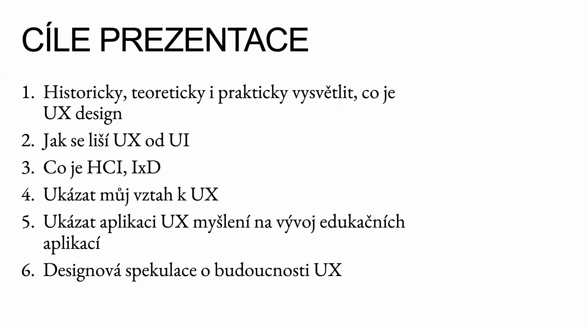
The aims of the lecture.
To begin, let me introduce myself properly. I am a doctoral student of philosophy at the University of West Bohemia in Pilsen and I also study new media. I have a warm relationship with ÚISK: I am one of its graduates, and for the past three years I have taught the course Principles of Interactive Creation in New Media Studies. In my research I focus on the philosophy of technology, design studies and media theory. They are diverse fields, but they intersect in many places. For me they meet in the question of how technologies influence our thinking, how they shape our perception of the world, our decision-making and our social relationships.
Alongside my academic career I have worked on projects in the commercial sector, in the IT industry, and I have gone through many roles. I started long ago as a tester, gradually moved on to coding and programming, and in recent years I have worked mostly in UX design. I had the chance to work as a UX designer on interesting projects at Hypoteční banka, but over the last three or four years I have been turning more and more to the academic, non-profit and educational sector, where I enjoy applying what I know about UX to building educational applications and websites.
From tester to coder
As I said, I like to talk about UX design through the lens of my personal story. Let’s start in the years 2005 to 2008. One of my first more serious jobs was as a software tester, specifically of banking applications in Java. A typical IT team working on such projects consisted of programmers, a graphic designer, coders, a project manager who had the final say, and analysts. Let me remind you that this is my subjective view of the teams I went through. In this period, the people with the final say on projects were the project managers, the analysts and the people who programmed. Graphic design, if it was part of the team at all, was mainly there to make things prettier: to make the buttons and colours a bit more pleasant so that people would not run away the first time they looked at the application or website.
Let’s move on two or three years. I am an HTML/CSS coder, so I am involved in developing applications and products both creatively and technically. The technologies in use were PHP and Java. What mattered most on projects? From today’s perspective it may sound a little bizarre, but the crucial thing was that applications had valid code. We placed enormous emphasis on something the user barely sees: the code had to be syntactically correct. Behind the scenes we of course talked about websites and applications having to be usable and “user friendly”, but when you pushed a little and asked what that actually meant, the answers were vague.
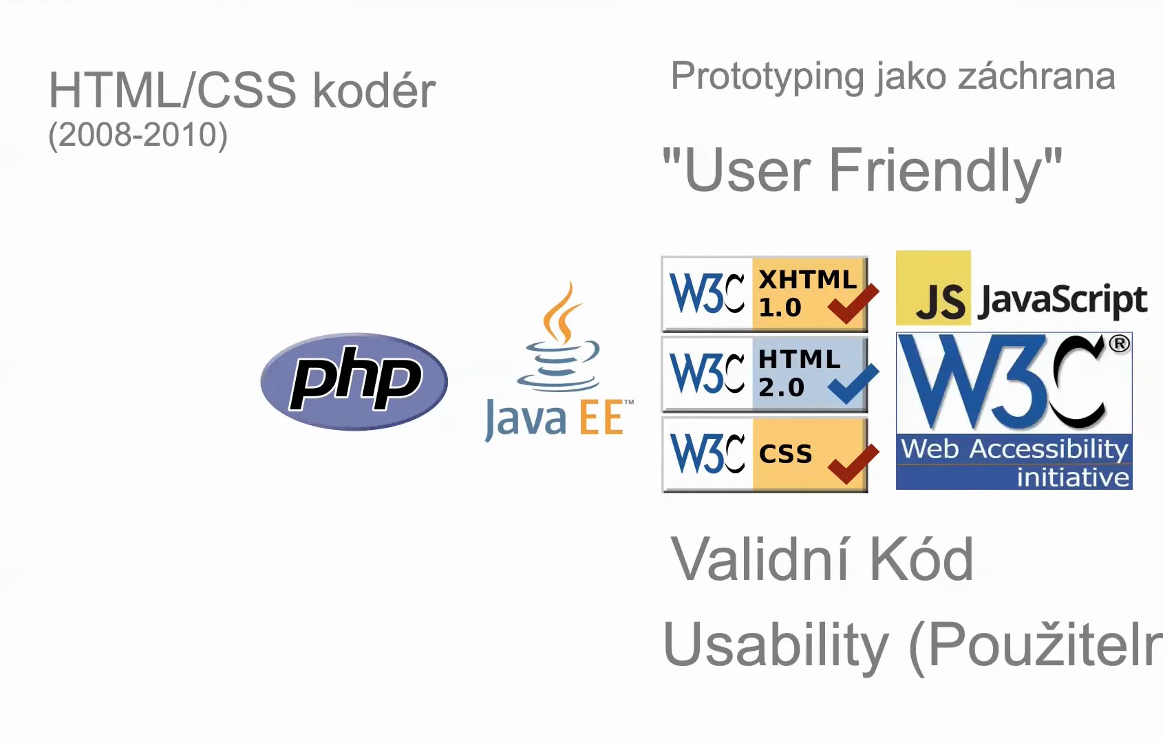
Valid code, “user friendly” and the prototype as a last resort: the years 2008–2010.
At that time I also noticed that prototypes were made on projects, that is, designs made before the coding began. My experience, though, was that the prototype was more of a last resort. We wrote the application and showed it to the client, and if they did not like it, we did not rewrite it; instead the graphic designers prepared prototypes with changes. We presented those to the clients, and once they approved them, we worked the small changes into the existing application.
For context, here is what the web looked like in 2008 to 2010: the home pages of the New York Times, Seznam, Google, Apple and an older version of the website of the Faculty of Arts at Charles University. Over ten years you can see great progress. It is due, among other things, to the enormous development of the web platform itself. Many things that were technically hard in 2008 are simple today. Even something as small as splitting the content of a page into three columns was demanding back then; today it is easy.
Even in 2010 to 2013, still from my view of projects and studios, the term UX designer was not used. At the time I worked for a smaller studio, MangoWeb, which still exists, and one of the last big projects I took part in was the redesign of the Respekt.cz website. So in 2013 there is still no talk of UX design. Where is it, and when does it appear in what I observed?
The paper incident
I’ll skip four years, and suddenly it is 2017 and I am a senior UX designer at Hypoteční banka. We recorded most of the brainstorming sessions and design workshops with colleagues on video. I tried to apply all the good practices of UX design there: we did a lot of brainstorming, sketching and wireframing before we started writing code.
While I was trying, in that role, to behave like a proper UXer and use the right methods of user research, something interesting happened to me, which I started calling the paper incident. Before designing a new application, I wanted, as UX design preaches, to ask its future users what they thought. In the commercial, corporate environment it was customary to communicate mainly with analysts and project managers. Coming down from the proverbial ivory tower and asking so-called ordinary users was not really the custom.

Design ethnography in practice.
So I spent a day at one of the branches. I did something we can call ethnographic research: I observed how the future users worked from the morning on, and I held semi-structured interviews with them. I was checking how the branch staff actually followed the procedures that analysts had devised somewhere else entirely, at the bank’s headquarters. And I found out something interesting. According to the recommended procedures, when a colleague was ill, for example, the information about the clients who were arranging a mortgage with them was supposed to be handed over through an internal application. For many people, though, using that application was too demanding, so they made things simpler: instead, a sheet of A4 paper with the most important information about the clients circulated around the branch. When someone went on holiday or fell ill, everyone knew where to find it.
It was quite a revelation for me. When I then reported my findings at a meeting, many people were surprised. I pushed for us to build what I had learned in the ethnographic research into the new application, so that it would follow how the branch staff actually think about sharing information. That is the paper incident.
What happened in 2013
You may be wondering what happened between 2013 and 2017. In 2013 I was a coder, a programmer and partly a designer at a studio, but I did not have the title of UX designer, and here in the Czech Republic it barely existed. Four years later I am a senior UXer. What happened to bring UX into the vocabulary?
In my practice and in my academic research alike, knowing what UX design is, what methods it has and what terminology, helps me a great deal in doing it. So among other things I looked at how people searched for these terms. Google Trends shows that around 2013 something shifted and searches for terms like “ux design”, “ux designer” and “user experience design” rose sharply. When we add “interaction design”, we see that from roughly 2013 interest in UX design grows, whereas interaction design is searched for less and less. Before that it was the other way round. We can add more terms, but the result is the same: around 2013 something happened.
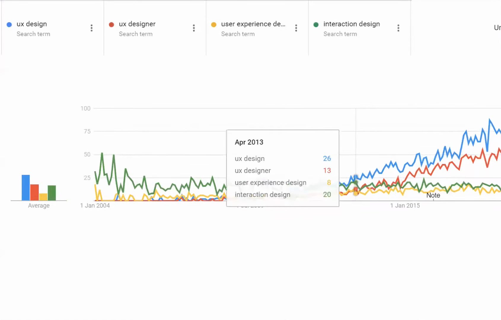
Interest in the terms UX design and interaction design in Google Trends. Data source: Google Trends.
I think several popular books came out that introduced UX design to a much wider public. Not only to people who were already designing or programming, but also to managers and analysts who had not heard of UX design before and suddenly found that UX fits quite well with what they themselves do in their work.
Don Norman and the term UX
I want to focus mainly on one book you may know: The Design of Everyday Things by Don Norman, published in Czech as Design pro každý den, the bible of human–computer interaction and UX design. I consider Norman, and I am not alone in this, one of the most important people in UX design and in the field of Human-Computer Interaction. I call him the gateway drug to UX design, HCI and interaction design, but also to more scientifically oriented fields such as cognitive science or the psychology of design.
What has Don Norman done to become so important in the context of UX design? He worked at Apple as a UX architect, and it was he who in 1993 came up with the term user experience. Interestingly, he was originally trained as a cognitive scientist, psychologist and engineer. He was and still is an academic, and he published classic academic papers before he turned to design. Besides The Design of Everyday Things he wrote a number of other books. And in my, again slightly subjective, opinion we can follow quite well in his publications how thinking about the design of interaction between people and computers, between people and technology, has developed.
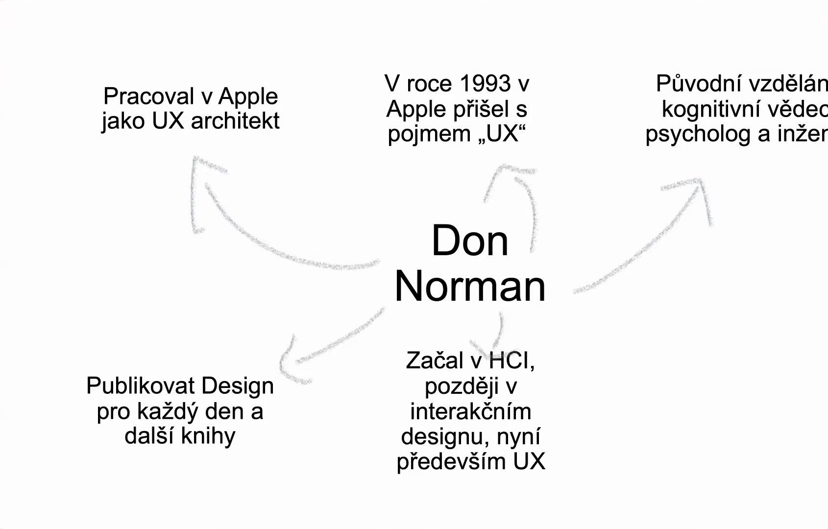
Don Norman in a nutshell.
At the lecture I played a short video in which Don Norman himself explains what he meant by the term. Essentially he says that when he was at Apple, he thought that besides the products themselves they ought to deal with the wider context in which they are used. Apple was good back then and has long been known for its emphasis on design and usability. But around 1993 UX design did not exist, and neither did thinking about the wider context in which we use products, not just about how they look and how they work. In the video Norman talks, for example, about the box the product comes in: whether it is too big, how we get it home. He began to see the product as one point in a larger system of services and products, one of many places where the customer comes into contact with it, which together shape the experience of the product or service.
At the end of the video Norman says that since then the term UX has increasingly been used outside the meaning they originally gave it. It has become a buzzword, a term people use without knowing exactly what it means. In the video and in other articles he stresses the difference between the user interface, UI, the interface we actually interact with and click on, on the screens of phones and laptops, and what they called user experience, or user experience design. According to him, we should understand UX as a system.
What does it mean to understand UX as a system? Before we get there, it helps to take a very brief, bird’s-eye look at how the field of HCI developed.
A brief history of HCI
Human-Computer Interaction is a field that, very broadly, deals with the relationship between the human, the user, and technology, not only the computer. It has gone through several stages, paradigms that determined what it would do, what methods it would use and what problems it was meant to solve. Reading the literature, I have identified, and I am not the only one, four main paradigms.
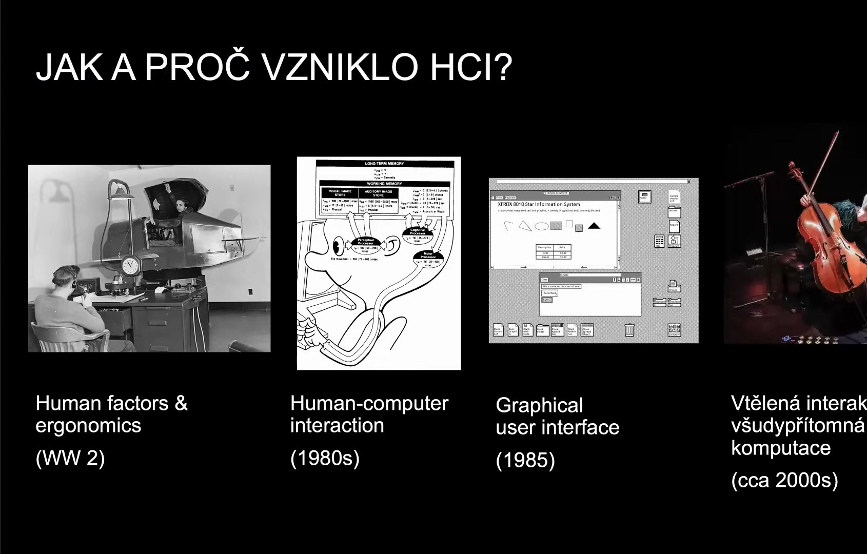
The four paradigms of HCI.
We can call the first one human factors and ergonomics. Around the First and Second World Wars, the fields of ergonomics and human factors emerged, studying how to make machines and technology friendlier and more usable. One of the important problems of the time was why planes crashed even though their pilots had perfect education and training. It turned out that the problem was neither in the pilot nor in the aircraft’s technology but somewhere in between: in the interface, in all those knobs and levers. They were too complicated, and when a stressful situation came, the interface did not help the pilots do what they had to do, and planes crashed. In this first paradigm, the point was to take the human body and design machines to fit it, “a good fit between human and machine”. People studied the body’s proportions, functions and limits. We are talking roughly about the 1950s.
In the 1980s, HCI begins to apply the latest findings of the cognitive science and psychology of the day, which saw the human being, to simplify a great deal, as a slower analogue computer. Researchers studied how quickly a person processes information, how many things they can hold in memory and for how long. HCI thus becomes a field that looks at the human as a somewhat slower and less powerful computer. Unlike the previous paradigm, it is no longer so interested in how tall you are or what your body proportions are, but in how the human mind works, what a person with their brain is capable of doing, and how fast. Many interesting and, from today’s perspective, esoteric methods emerged. One of the most popular judged whether a system was well designed by how quickly a person typed a word or clicked the mouse. Today we know these are still important aspects of interaction, but certainly not the most important ones.
Then comes the graphical user interface, which brings plenty of new problems, but also new possibilities for designing human–computer interaction. HCI suddenly becomes much more oriented towards design and begins to apply the long-proven practices of graphic design and typography: typographic rules and grids that determine where things go on the screen so that they are clear and pleasant to the human eye. At the same time, the people who design interfaces realise that we cannot apply the lessons of graphic design one to one. Computers have a new dimension, and that is time. Unlike paper or the page of a book, user interfaces are interactive.
Interaction design
At the lecture someone asked at this point what the typical user looked like back then: whether they were still experts or already people who were not well versed in technology. In the 1980s computers were very expensive and were used mainly at work. So the typical user was someone who worked with a computer in their job; there were no home computers yet. That changes in the mid-1980s and in the 1990s. The people who built systems realised that computers were increasingly used by people without a technical or design education, ordinary people who use them not only for work but also for personal matters. This led to the need for a new discipline to deal with it: how to design interfaces for ordinary people. That is how interaction design came about.
Interaction design was much more practical and design-oriented, and it was aimed much more at the ordinary user. When we read the people who were there at its birth, we see that they wanted to create something like product design for interactive digital surfaces and interfaces. Interestingly, interaction design was forgotten for about ten years. It emerged around the second half of the 1980s, but its methods fell into oblivion until people like Alan Cooper rediscovered them.
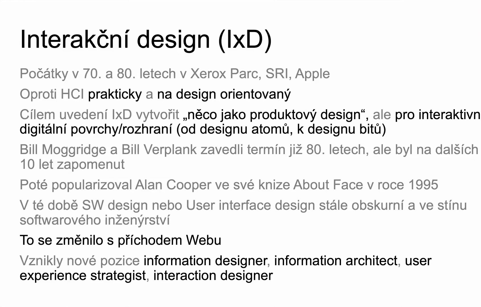
Interaction design: from Xerox PARC to the web.
Even around 1995, roles like user interface designer were very obscure and stood in the shadow of technically oriented thinking: engineering and programming were privileged at the expense of design. That changed with the arrival of the web. Technology really spread, every other person had a computer and wanted to get onto the web as fast as possible. The better websites worked, the more time people spent on them, and so new roles emerged, such as information designer or information architect.
Goals instead of tasks
Interaction design is the subject of the book About Face by Alan Cooper. It runs to about five hundred pages, so I will only attempt a brief summary. Interaction design says that as designers we should focus on users’ goals rather than on the tasks and actions the user has to perform. It brought the concept of the persona into the design vocabulary. And it emphasised iteration: when we design something, there is very little chance that we will get everything right the first time. We need to test and go through several rounds of design, and only after the third or fourth round is the design relatively functional and usable.
What does the emphasis on goals rather than actions mean? Let’s say we are designing an app for ordering pizza. The user’s goal is to eat pizza. The actions we have to take to get there today are: unlock the phone, open an app, say Dáme jídlo, choose a pizza, put it in the basket, pay, read the confirmation email and so on. Interaction design and people like Alan Cooper say that while the actions by which we reach our goals change from year to year depending on the technology available, users’ goals are relatively stable. We wanted to eat pizza in 1921 just as we do in 2021, but when we think about how ordering a pizza differed then and now, the differences are huge.
Interaction design also introduced the persona, as many of you probably know: a fictional archetype of a user, but one based on real data. A persona has a name, some characteristics and, ideally, a description of their everyday life. What is it for? To improve our empathy towards future users. When we have the persona in front of us while designing, we can always ask what this user would say about a button at the top or at the bottom, or about this or that feature. The ideal is that personas, fictional but based on real user research, help us put ourselves in the shoes of future users.
Interaction design also introduced the need to prototype and make wireframes. Before we reach for Photoshop or write the first line of code, we should sketch out what the application will look like. We can test prototypes, and when we find out that something does not work or users do not understand it, we can quickly throw it away and design it again. That is the advantage: throwing away a feature while the prototype is on paper is very cheap. Once the application is designed, God forbid programmed, throwing it away and designing it again costs time and money.
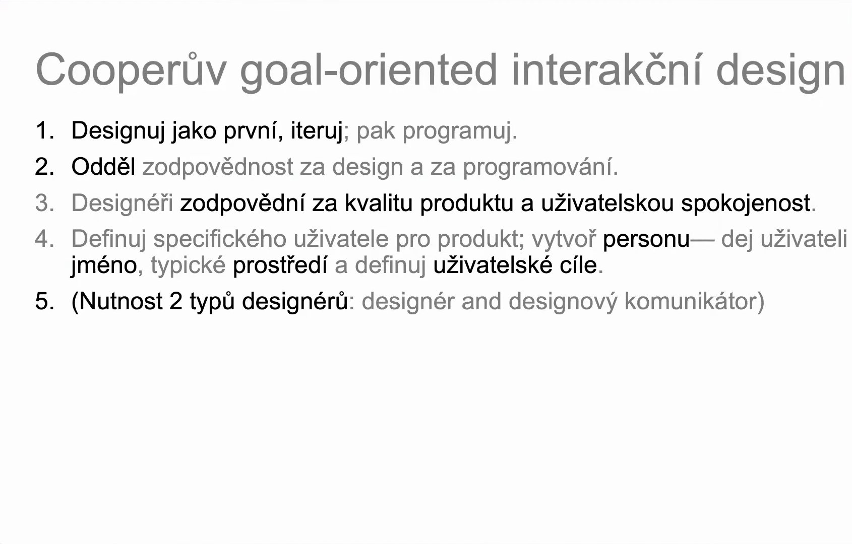
The principles of Cooper’s goal-oriented interaction design.
Alan Cooper sums up what we should stick to if we want to practise interaction design, and he also describes the ideal process. I will leave that on the slide. I will comment only on the fundamental change interaction design brings: programming and the actual design in a graphics program come only towards the end of the design process. At the beginning, user research matters much more: finding out who our users are and what goals, requirements and problems they have that our applications and products can solve.
Embodied interaction
That is the 1980s and 1990s. Then we come to the present, when people do not use technology only at home at a desk. Smart devices appear that we use in new contexts, outdoors. Using an app calmly at home is something different from standing at a bus stop and needing to find out quickly when the next bus is coming because ours has just left. This is what a school of thought with several names in the literature begins to deal with. I call it the new paradigm of embodied interaction. HCI begins to take an interest in interaction with technology outside the standard context of work or home: when we order a ticket, look for the metro or for the next connection at a stop.
As an example I mention Zoe Keating, my favourite avant-garde cellist. She combines a classical approach to playing, and she is classically trained, with the use of technology: as she plays, she records individual parts of her playing into a laptop one by one and then uses technology to layer them with what she is playing on the cello at that moment. That is one of the problems the paradigm of embodied interaction studies and comments on.
One of the people who study this paradigm is Paul Dourish. He notes that when we take a bird’s-eye view of how technology, interfaces and interaction have developed, the relationship between humans and technology becomes ever more abstract. At the lecture I asked the audience what was in one picture. A telephone exchange? Very close. It is a computer, even though it does not look like one at first sight. The 1950s, the first mainframe computers, and communicating with them was done, believe it or not, by rewiring cables, much like in a telephone exchange. The computer was programmed by rewiring cables. The relationship between computer and human here is very concrete: I am literally reaching into its electronics.
One step further, we are already writing code, which is still very close to the hardware, but it is already an abstraction, no longer rewiring cables. According to Paul Dourish, there then comes a phase when we still write code into a terminal, but it is getting closer to natural language, usually English. And then graphical user interfaces appear, where we interact with the computer not by writing code we have to remember, but by doing something on the screen. Incidentally, Ivan Sutherland invented the program Sketchpad, the very first to allow interaction with a machine using a light pen.
If we follow that line of abstraction further and focus on what embodied interaction studies, we arrive at the present, when technologies are all around us, interact with our surroundings and are controlled by touch, voice and gestures. Technology is no longer an obscure box on the desk but an ordinary part of what we do every day, for example when we pay at a self-service checkout. I do not want to promote Microsoft, but I recommend their videos from recent years in which they imagine a future where technology will not be on our desks, perhaps not even in our pockets, but interaction with it will be all around us.
One more brief summary of how interaction and interfaces developed. In the 1970s the computer is only for work, somewhere in an office. In the 1980s we start to focus more on ordinary users and decide that programs should be usable by people. In the 1990s more and more people use computers for work and collaborate on projects with the help of technology. At the beginning of the twenty-first century, technology really is all around us, and we see lots of new devices that we control by touch or voice. In this respect embodied interaction is not so different from what is called ubiquitous computing. It differs, however, in that it studies how technology works in our everyday lives: not only at work but also at home, when cooking, when taking the children to school, in teaching. The more technology is part of our lives, the more it has to respond to our everyday problems and worries.
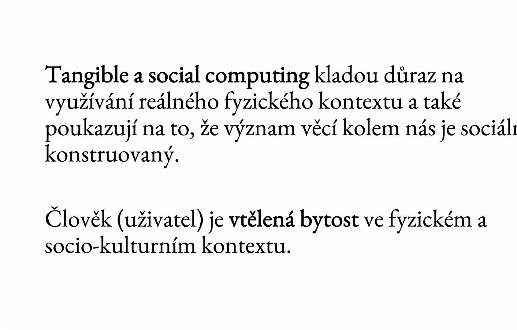
The human as an embodied being in a physical and sociocultural context.
One of the results of theoretical, historical and practical design research into how technology can extend our everyday lives is augmented reality. In it, technology does not just help us; it really extends what we are capable of as humans. At the lecture I played a video with an example of how the findings of embodied interaction can be applied to augmented reality in a museum. It is the culmination of a development in which technology not only fulfils work duties and handles everyday situations, but makes it possible to create a new layer over everyday reality that adds new capabilities and functions to what exists. The museum, and education in general, is a very useful context for this. Another example is the Vienna museum mumok, which used augmented reality to offer visitors something beyond ordinary physical reality. The whole museum building serves as a virtual canvas: when you look at it through the camera of a smart device, information about the exhibition and other content is projected onto it.
UX as a system
Let’s return to the question I asked a moment ago: what it means to talk about UX as a system. We have followed how technologies move beyond the work context, beyond our homes and pockets, spread into the world around us and enrich that world with new functions and properties. So we can say that user experience, as Don Norman for one sees it, means that we are interested not only in the person and their context, that is, their health, physical skills and proportions, interests, goals, family and the society they live in. We are also interested in how people communicate, work and interact with one another. And we must not forget that today, in the twenty-first century and especially in the time of coronavirus, communication between people is mediated by technology. In this imaginary diagram of UX as a system, technology is therefore an integral part of the relationship between people.
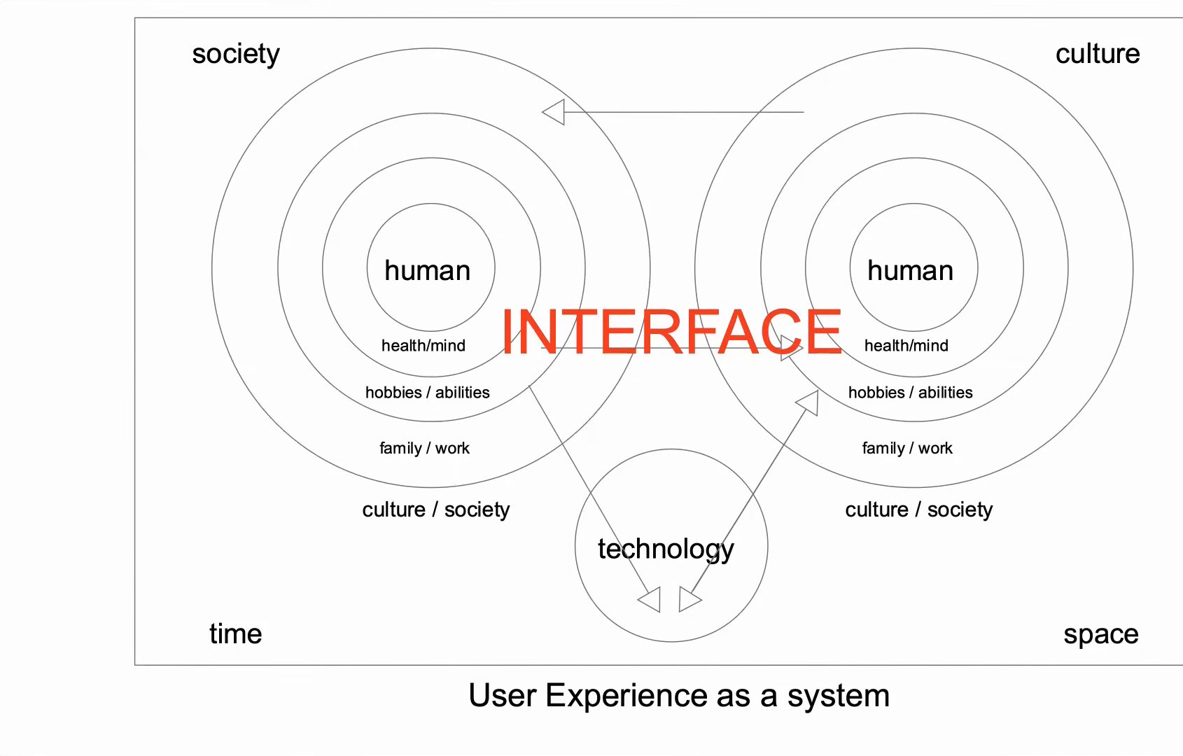
UX as a system: people, technology, society, culture, time and space, connected by the interface.
Last but not least, we must not overlook that interaction and communication between people and with technology take place in a wider context, in a particular society and culture and at a particular time. The difference between ordering a pizza in 1921 and in 2021 shows that time plays an important role. And so does space. As I said, it is one thing to use an app calmly at home at the computer and quite another when we are rushing to work or to pick up the kids from nursery, our bus leaves without us and we need to find out quickly when the next connection is. Ideally, an app should take into account that we will be using it under stress, somewhere outside where the connection may be poor, and display data and information quickly, concisely and simply. When we look at UX, at how technology is experienced, space, when and where things happen, is also very important.
And the interface figuratively connects everything with everything: people, technology with the human, but also the space and time in which people use technology. That is precisely why UX design inevitably draws on many existing fields: interaction design, which we have talked about, findings from HCI, but also from architecture, visual design, data visualisation, information design, cognitive science, sociology and others.
So is UX design really a new field, or is it rather a philosophy or strategy for using existing methods and knowledge so that we see technology as part of a larger system? My view, and the view of many others, is that UX design is not an entirely new field. It is a particular way of looking at the problems of the relationship between humans and technology: we are interested not only in how things work but in how people experience them. And to get at least closer to that experience, we use all the existing fields, their knowledge and their methods.
The problem of other minds
Speaking of experience: I recently read a book by the Czech philosopher Alice Koubová, Myslet z druhého místa (Thinking from the Second Place), which deals with the problem of other minds. It may seem that we have strayed too far into philosophy and that this has nothing to do with HCI, UX design or the design of technology. But I think HCI and UX design are tackling a four-hundred-year-old problem: how we can get at the way other people think, how they experience and perceive the world and technology.
Connected to this is the need to distinguish between the user and the designer, that is, between the people who design technology and the people who use it. A designer may have expert knowledge of how to create technology, but does not have expert knowledge in specific fields. Someone who designs educational applications may be an expert in how to make them, but is certainly not an expert in didactics. When we make applications for teaching history, the designers need not be experts in history and the teaching of history, and that is exactly why they need experts with that knowledge beside them.
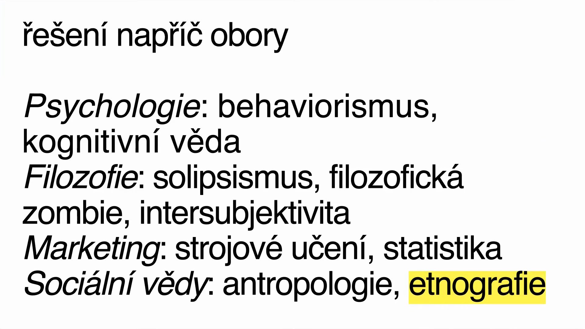
How different fields tackle the problem of other minds.
Different fields have historically tackled this problem in different ways. In psychology, various paradigms have tried, and still try, to peek under the lid of the human mind. Philosophy has dealt with it in many contexts. Marketing today tries to work out what users want with machine learning and statistics: it tracks which pages people visit and exactly where they click on ads, and evaluates it statistically. The social sciences have anthropology, sociology and ethnography, which study how people behave, what goals they have and how they experience everyday situations. And in design we have several paradigms, whether interaction design or user experience design. In my view they exist precisely because of this one problem: we cannot clearly see into a person’s head and find out how they experience things and why they experience them in just that way.
The Double Diamond
If we look at the concrete processes used in everyday practice that codify these approaches for making technology, applications and websites, there are three fairly well-known ones. The process of Alan Cooper, which we have already talked about. The process of the American design studio IDEO, which did a great deal to spread awareness of what human-centred design means. And the process of the British semi-public body the Design Council, which is called the Double Diamond.
I will take a brief look at the Double Diamond, because when we compare these processes, they are very similar and solve the same problem. At the beginning, before we start programming and designing, we should know something about our users. We should do user research, get data on how users behave and perhaps create personas to help us empathise with the potential users of our applications and products.
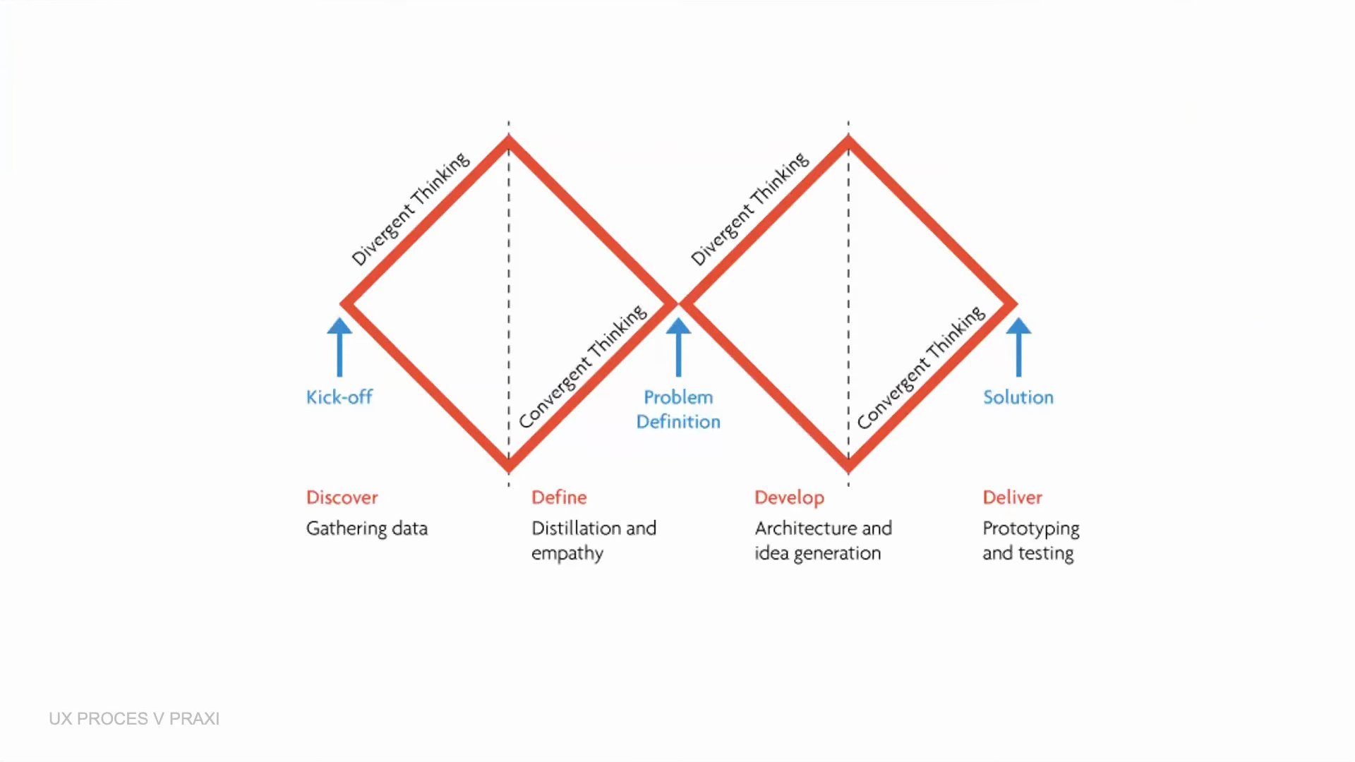
The Double Diamond according to the Design Council.
Why is the process called the Double Diamond? It consists of two parts. The first diamond is about research: we gather data about users and study them, among other things with ethnographic methods, in the real context in which future users move. Just as I did my ethnographic research at the Hypoteční banka branch. Because I was there, I learned a lot that was new to me about how users actually behave and how they use the existing systems, which I would probably not have discovered otherwise, had I not come down from the proverbial tower among the mortals, the people working at the branches. In the second diamond we take the gathered data and insights and start creating the application or product itself.
So, what is UX design?
If we were to sum up roughly what UX design is, I offer a summary from the literature that I agree with. First, UX design is not necessarily a new field, but a new view of how to design services, products and things for people. We see products, services, people and things as parts of a larger whole. An app on a phone, and the phone itself, never exist in isolation. When we design a smart device, we have to take into account that people will use it in some context.
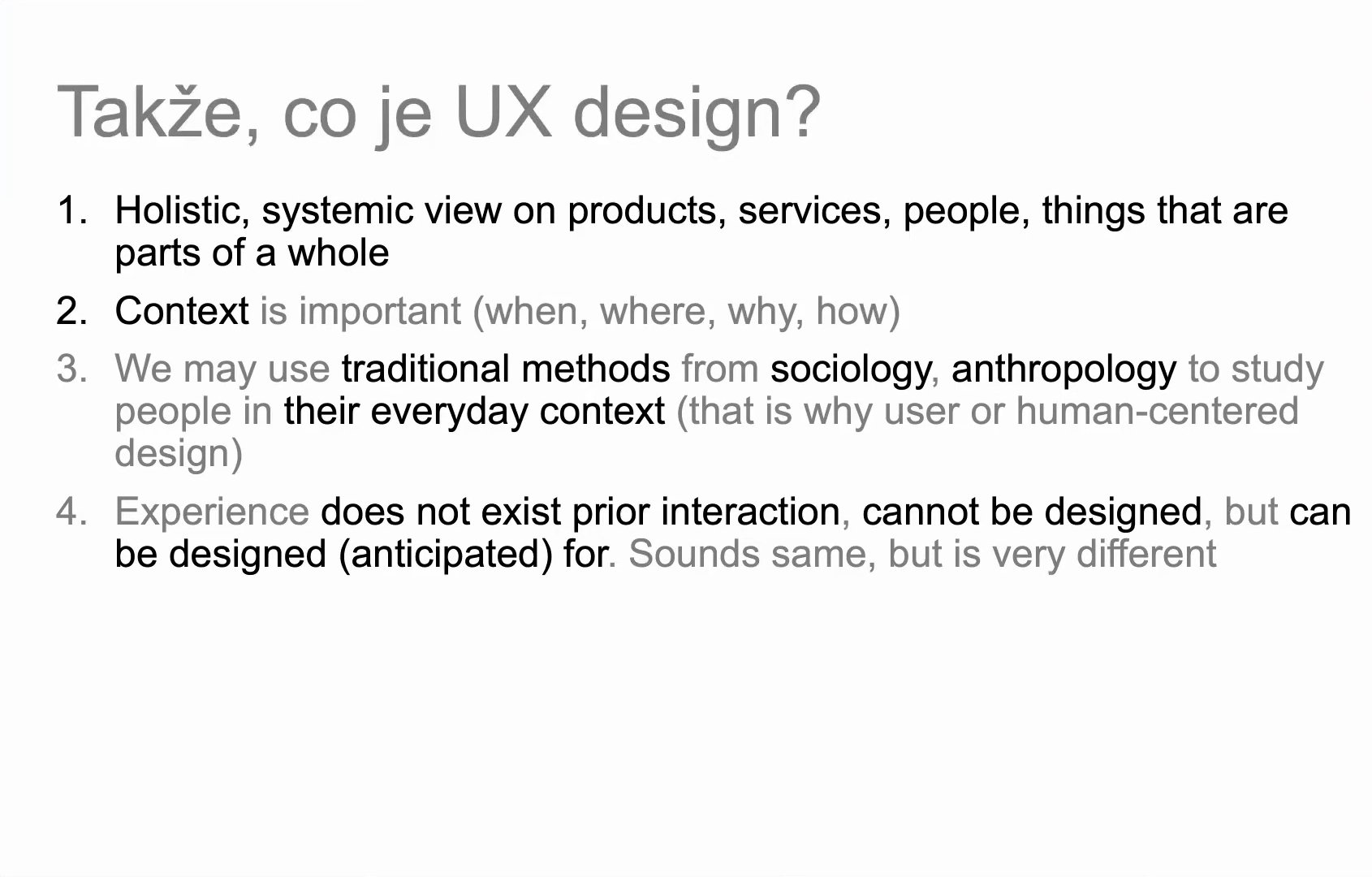
Summary: what UX design is.
Second, there is context. I have mentioned it several times today, but it really is very important: the questions of where and on what occasions things are used matter enormously. Take the bus stop example again. Designing an app that is too complicated and makes us click through three or four screens before we find the information we are looking for would be a mistake: at a moment when we are stressed, in a hurry and need to find the next connection, such an app would be practically unusable.
Third, because of the problem of other minds, since we cannot see into other people’s heads, UX design can use the traditional methods of sociology, anthropology and ethnography. And fourth, a slightly philosophically tinged insight: the experience does not exist before the interaction; it cannot be designed, only anticipated. From the office we cannot guess how people will actually behave. We have to go out into the real world and study people in their real context.
The interface as mapping the invisible
Before I move on to examples from my own practice of how I design educational applications: I have mentioned the interface several times, and you may be wondering how I think about it and how the literature talks about it. The most standard definition says that an interface is a means that enables communication between technology, the computer, and the human. It is entirely correct and there is nothing wrong with it. I prefer, though, to see the interface as something that gives us access, a window or a door, to an environment or system that we otherwise could not see, perceive or experience in any way.
This definition, which I find very interesting, comes from the contemporary media theorist Benjamin Bratton. He imagines the present in such a way that the city, data, users, networks and even the physical layer of the planet Earth are part of one big whole, which he calls The Stack. What he means is that we live in an environment where more and more things around us are digitised, and in order to have access to information, data and knowledge, we need an interface. Without it we would have no access to the layers of networks, to the cloud and so on. It is, of course, a great simplification, but I like this definition. When we think about the interface this way, it is not just the screen and the buttons we press on a phone or a website. Interface design is a mapping of the invisible; in the digital environment, for example, a mapping of data.
An interface defined in this way can be found in history too, before computers existed, and in surprising situations. John Snow, a physician living in nineteenth-century London, was trying to find out why cholera was spreading in the city. People were at a loss, and Snow became famous for a method that is still cited in the literature as an example of data visualisation, or of a paper “interface”. He took a map of part of the city with its streets and made a mark wherever a case of cholera had appeared. Most of those infected were on Broad Street. He also marked the water pumps, the sources of water, on the map, and found a correlation between the pumps and the number of infected. He concluded that the water from those sources was probably contaminated and that this was why the people around them suffered most from cholera. It turned out to be true: the water sources were cleaned up and the cholera receded.
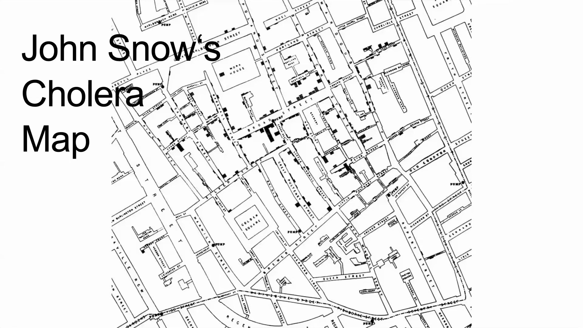
John Snow’s cholera map from 1854.
The second example, if we stay with that slightly unusual definition of the interface as mapping the invisible, comes from the twentieth century. The Chilean government, strongly influenced by socialist ideas, decided in the Cybersyn project to map the hitherto invisible processes of the country’s economy. It designed a system that was to display various economic processes on screens: supplies, food deliveries and more. In the end the project remained unfinished, but I like to cite it as a slightly utopian example of the role the interface and the mapping of the hitherto invisible could, in theory, play at the level of an entire state.
And a very contemporary example. Many of you probably know the media theorist Lev Manovich. For the last five or six years he has been doing less media theory and more work on how to use data analysis to learn how culture works and how people behave. One of his interesting projects is called Selfiecity. It still exists; you can google it and read in detail what it was about and what it found. Briefly: the project downloaded selfies from Instagram from various cities, Moscow, Berlin, Bangkok, São Paulo, New York and others. Every photo on Instagram can be tagged with the place where it was taken, and the research was built on that. The team then studied what the photos could say about the behaviour of users in those cities and found many interesting things. For example, the biggest gender difference was in Moscow, where over 82% of everyone who uploaded a selfie to Instagram were women and only 17.3% men. For me this too is an interesting example of how data visualisation, an infographic or an interface enables the mapping of the invisible, of what we normally cannot see, hear or feel with our senses.
Without research it is not UX design
At this point a question from practice came from the audience: in the questioner’s view, the phase of empathy, creating personas and preparation has long been underestimated. People already know they should think about the target group, but they stop at a general “for the professional public” and never say whether it is a seventy-year-old retired professor or a university student. The makers look forward to building the product and treat research as a necessary evil to be cut short.
Speaking for myself: if we do not do user research, do not create personas and do not study, for instance through design ethnography, how people actually work, as in my example from the Hypoteční banka branch, then we are not doing UX design but something else. Graphic or visual design. If we ignore the research part and go straight to creating the visuals, we deprive ourselves, first, of what many UX designers find fun and beneficial: communicating with people, going to see them and designing a thing not for an abstract user but for real people of flesh and blood. That helps us with empathy. And second, as many of the people I have mentioned point out, UX is not about the graphic design of an application or a website, but about perceiving that what we create is part of a larger whole. If we do not do user research and do not find out who our users are, what they do, what problems and goals they have, then, according to Don Norman too, as he said in his video, it is not UX design.
As for personas: I agree that many people treat them perfunctorily. They hold one workshop or brainstorming session, sit down, write down off the top of their heads who their users might be, and that is the end of both the user research and the personas. It is important to remember what the authors of the persona concept say: personas are fictional users, but they should always be based on real data and insights and be a synthesis of different types of users. In short: when we do not do user research, we are not doing UX design, and we miss out on many interesting parts of the design process that help us empathise with future users.
The Database of Members of Parliament
Finally, I want to show how I apply the lessons of UX design myself. I work in the academic, non-profit sector, specifically at the Institute for the Study of Totalitarian Regimes (ÚSTR), where I work on two projects: the Database of Members of Parliament and the Museum of the Labour Movement. I will focus only on the first. The project maps the history and development of Czech parliamentarism. At its start, a huge database was created of all the members of parliament who represented the Czech lands in the various forms of parliament, whether in the Imperial Council and the provincial diet under Austria-Hungary or in the Czech parliament after the revolution. When I joined the project, I had a large database of members of parliament and a brief: to create a project that would map them through infographics, visualisations and maps.
As a proper UXer, or at least someone who tries to do UX honestly, I made sure we spent a long time, about a month and a half before designing anything, thinking about the future users, their problems and goals. We created personas and identified several types of people who might use the application. The Database of Members of Parliament could serve students who want to learn something, whether for themselves or for a test on Czech parliamentarism. In the persona we defined an approximate age, a short scenario of how they would use the application, and their needs and goals. Another persona is teachers, who should be able to use the application as a teaching aid. The application should therefore have, for example, a glossary of entries and topics with brief, clear explanations of terms related to parliament, such as co-optation, a specific term from the development of parliamentarism, as well as attractive audiovisual materials that teachers can use in class. We defined other personas too, with their goals and requirements. I tried to make sure we referred to them at every meeting. I admit it did not always work.
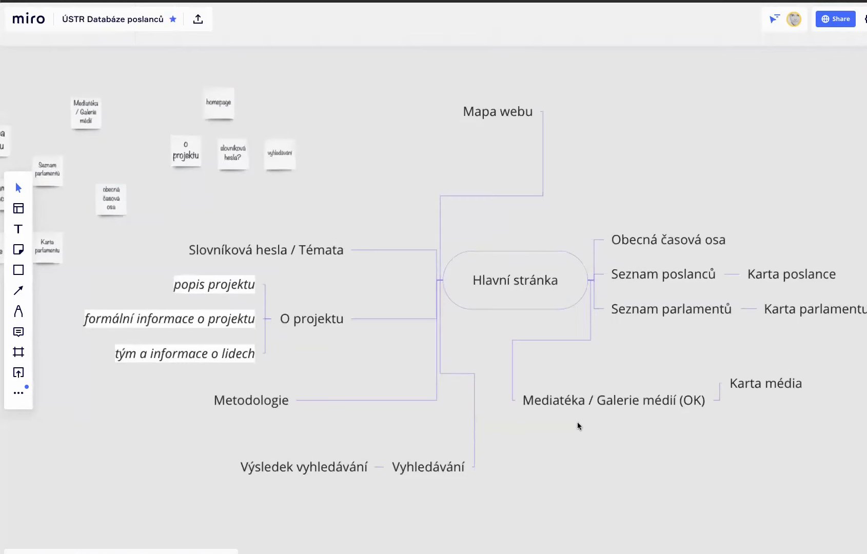
The structure of the Database of Members of Parliament in Miro.
Then, step by step, we thought about the structure, the information architecture of the application. We decided it should have a home page introducing the project. Since it is about the development of Czech parliamentarism, a timeline is useful, showing briefly and clearly the order in which the key moments came. A glossary that students and teachers can refer to in class. And a media gallery with audiovisual materials, illustrations and perhaps even period caricatures of members of parliament. Once we had the sitemap, the structure of the application, we looked for inspiration in existing applications that map parliament with infographics, for example a seating plan. We wanted something like that too, because people have probably seen it before, and when they see it on our site they will not be confused and will know how to use the infographic.
That, in short, was the research phase, in which we defined the personas, the structure of the application and the user goals the application should meet. Then I started prototyping, that is, creating the structure of the future application. I did not deal with colours and buttons, but with what should roughly be on each page and roughly how it should be displayed. On the list of members we want previews, photographs, and also statistics, for example on the average age of the members or their education.
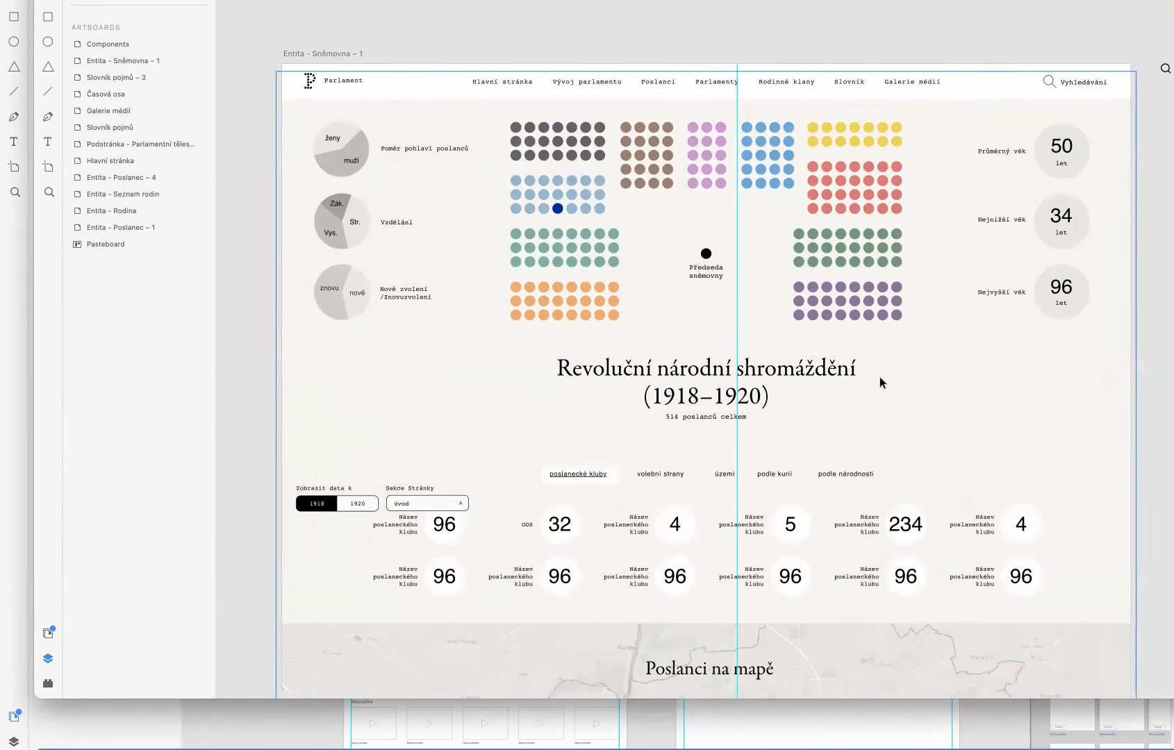
Design of the Revolutionary National Assembly page, inspired by the seating-plan infographic.
With the rough design of the application in hand, I then worked on the graphics with my colleague, the graphic designer Dan Vojtíšek. We took the prototype, the wireframes, and turned them into a concrete web application. My colleague worked in my findings and gave it a look meant to be modern and attractive to users. When we display a single chamber, we draw on the seating-plan infographic and in this way show the number of people in that chamber, for example in the Revolutionary National Assembly, together with the statistics that the finished application will have. There is also a glossary of terms, designed by my colleague, or rather we implemented it together into the prototype. And a timeline of the development of parliamentarism, which will be much longer; for now it shows what three key points will look like. That is an example of how we applied the UX process.
The UX designer in the education sector
Lastly, and with this I will finish, something about the role of the UX designer in the non-profit education sector. In my experience, it is in the education and non-profit sector in particular that the UX designer is a bridge between the academic experts, who have the know-how about the field, say the history of Czech parliamentarism, and the technically oriented colleagues who work with us on the project.
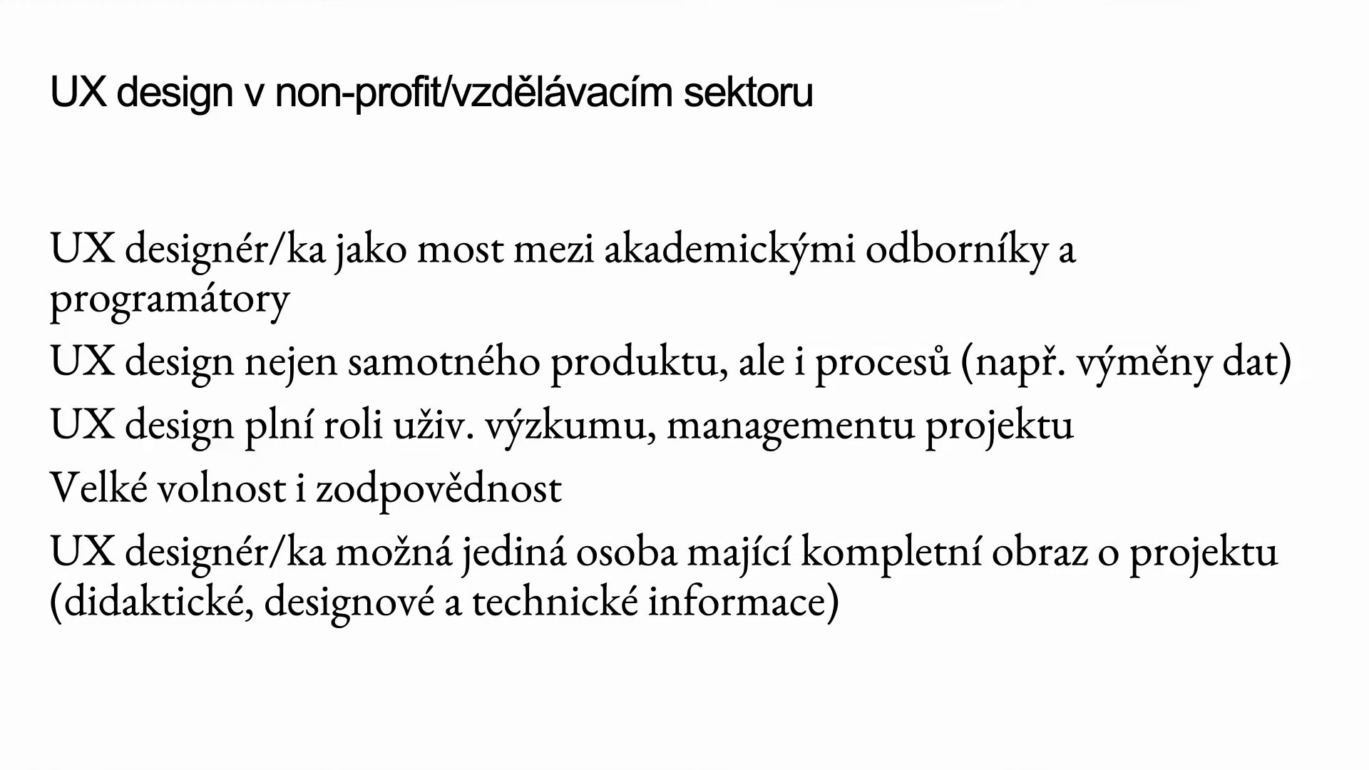
The role of the UX designer in the non-profit and education sector.
I have also found that in this sector, as probably in most sectors, I design not only the product, the application, but also many things around it, for example how people will exchange data and information. Not all our colleagues and experts are technically adept enough to use the latest apps for sharing data and texts. I realised that communication within the team is an integral part of what I do as a UX designer.
The UX designer, at least in the education sector, also plays the role of project manager. Perhaps that is too strong a word; rather someone who stands beside the conventional manager and helps work out the next step, both in the application and in the development of the whole project. This is where knowledge of design processes proves its worth: from the position of UX design we can say that once we have user research, we should use its findings to create prototypes. That is knowledge conventional managers usually do not have. It is not their fault; UX design is simply still relatively new in the less traditional sectors of application and web development. And last but not least, UX designers are perhaps the only people in the whole team who have a more or less complete picture of the project: in terms of didactics, design and technical information.
Conclusion: the future of UX design
And the very last conclusion. I think UX design will become more and more important, above all in education. Not only because of coronavirus, but in general more and more things will move online. It is similar with new technologies such as blockchain or cryptocurrencies: they have only recently begun to spread more widely among the general population, and that is thanks to interfaces that reduce their relatively great complexity to something an ordinary user can use and understand.
Speculations about the future of UX design.
In my view, UX design is a strategic advantage in the education sector and elsewhere, because it stands at the intersection of technology, education, design and perhaps even political and social questions. Designers can thus use the insights of design to propose fictional futures that show how things could be different, and better.
From the discussion
To the question of how long it takes to create such an application: the Database of Members of Parliament would normally take perhaps a year, but under the circumstances it had to be done faster. At that point I had been working on it for about half a year and the launch was planned for the following month. Development could be sped up partly because I am not just the UX designer on the project; I also program the whole application. That has its advantages: I have a good overview of how the application should work and what each button on the pages is for, so not as much information gets lost between design and programming.
The length, of course, depends on the scope of the project and its basic conditions: what budget and deadline you have. Those are the limits that determine how long you can spend on user research. And to return to the earlier question: we often see user research reduced to speculation about what users might do, and the budget and the deadline are one of the reasons why it is not done at all or only superficially. Then it is up to UX designers to be advocates for future users, to insist that user research is important and to become evangelists for what UX design actually is. Which, by the way, I forgot to mention: when I worked at Hypoteční banka, I spent most of the first weeks explaining what UX design is for, because in a more corporate environment it was something very new and unknown.
Another question was where one can learn these skills and whether there are publications that would help. Let me blow my own trumpet: one option is the course Principles of Interactive Creation in New Media Studies, where you learn about UX design from various perspectives. Probably the easiest way into the world of UX design, though, is Don Norman’s books. If you get The Design of Everyday Things, or his other books, you will have a good overview of the problems you would be solving as a UX designer. And I can also pass the ball to my colleagues at KISK in Brno, who work very intensively on service design and UX design.
The discussion also brought up the point that one learns a lot of UX design in practice, because the process rests on feedback from users and on iterations. I fully agree. That applies not only to design, but in design it shows very clearly: a theoretical and historical grounding is important and useful in many respects, but in the end design is about creating real products, services, applications and websites. The reality of making things is always a little different from how it is written and talked about. Every project has its specifics, and even though projects share many things, each one is new in its own way and something unexpected will happen to you in it. When you reflect on it afterwards, you can use it in the next project.
A bit of a counter-argument: at design schools, the history and theory of design are often looked down upon. I very much like the work of the Czech design theorist and historian Jan Michl. He points out that design never comes out of nothing. It may seem obvious, but because designers always build on the projects and solutions of their predecessors, we never do anything entirely new and innovative. And that is not bad, it is perfectly fine: that is how design has always worked and always will. Knowing what problems designers solved in the past can therefore help us with the design problems of the present and the future. Jan Michl says that history and theory are very important because the history of design is a storehouse of knowledge and of ways to solve current and future design problems.